
50 Years, 50 Graphs

“The past is a foreign country; they do things differently there.”
― L.P. Hartley, The Go-Between
There is a palpable sense that the post-war “era of good feelings” is over. Thus in the last few years we have seen the publication of a welter of tellingly-titled books on our national decline (e.g. The Age of Discord, The End of the American Century, The Unwinding, The Great Degeneration), themes of decadence, decay and dissolution abound in cultural works – from the high art of Don Delillo’s fiction to television series such as Dopesick, Mayor of Kingstown and American Rust – and a little soaking and poking on the Internet will uncover a stunning range of websites, social media accounts and discussion forums organized around celebrating or accelerating institutional collapse in the United States.
What’s behind this inescapable sense that something has gone very wrong with us? NYU social psychologist Jonathan Haidt offers a provocative answer:
What is happening to the United States…? It sometimes seems that everything is coming apart. To understand why, I have found it helpful to think about an idea from cosmology called “the fine-tuned universe.” There are around twenty fundamental constants in physics — things like the speed of light, Newton’s gravitational constant and the charge of an electron. In the weird world of cosmology, these are constants throughout our universe, but it is thought that some of them could be set to different values in other universes. As physicists have begun to understand our universe, they have noticed that many of these physical constants seem to be set just right to allow matter to condense and life to get started.
For a few of these constants, if they were just one or two percent higher or lower, matter would have never condensed after the big bang. There would have been no stars, no planets, no life. As the late Stephen Hawking famously put it, “the remarkable fact is that the values of these numbers seem to have been very finely adjusted to make possible the development of life.”
…I’d like you to consider an idea that I’ll call the fine-tuned liberal democracy.
…Here is the fine-tuned liberal democracy hypothesis: as tribal primates, human beings are unsuited for life in large, diverse secular democracies, unless you get certain settings finely adjusted to make possible the development of stable political life.
What Haidt is suggesting here is that liberal democratic orders rest upon a vast foundation of intricately connected social, political, economic, religious, and cultural “constants” whose values must be relatively fixed at specific levels in order to produce prosperity and stability. Two questions arise from this insight. First, what, exactly, are the “constants” that must be optimized to perpetuate a prosperous and stable liberal democracy? Second, what happens when these “constants” become variables, increasing or decreasing exponentially over the course of a few years?
Sadly, no one has good answers to these questions. The best we can do, at this point, is make some educated guesses about what the “constants” are and track how much they have changed in recent years.
Here, I make an initial effort at fleshing out Haidt’s “fined tuned liberal democracy” hypothesis by presenting data on 50 different features of life in the United States over the last 50 years. The graphs below are not meant to suggest any particular set of causal relationships. Each of the developments tracked below is a cause and consequence of our current state of affairs. A source and a symptom.
Collectively, however, these 50 graphs tell a simple story: in a few short decades, the United States has been transformed into a fundamentally different kind of place. To paraphrase L.P. Hartley, “America’s past is a foreign country; they did things very differently there.”
Graph #1: Number of Immigrants
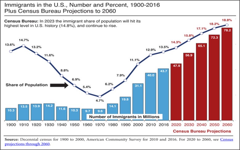
It’s commonly said that the United States is a “nation of immigrants.” It would be more accurate to say that the United States is the “nation of immigrants,” with more foreign-born residents than the next five highest immigration destinations (Russia, Saudi Arabia, Germany, the United Kingdom and United Arab Emirates) combined. In the six decades since the passage of the Immigration and Nationality Act of 1965, somewhere between 60 and 75 million people have immigrated to the United States. In raw numbers, immigration of this scale (occurring at this speed) has never happened before in human history.
Graph #2: Immigration by National Origin
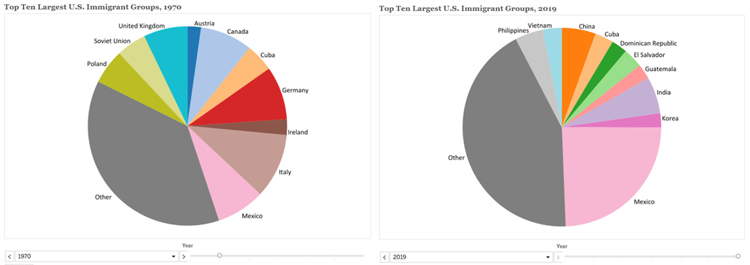
It is not, of course, merely the number of immigrants arriving in a country that matters for how a country responds to changing immigration levels. It is also the composition of the incoming immigration population. Despite repeated claims to the contrary, the post-1965 immigration system fundamentally altered the demographic profile of the country by dramatically decreasing the relative number of immigrants from Europe and dramatically increasing the relative number of people immigrating from Asia, Africa, and the Americas.
Graph #3: Undocumented Immigration
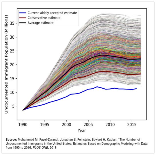
The Immigration and Nationality Act of 1965 also imposed a cap on total immigration from the Americas, placing limits for the first time in history on the number of immigrants who could legally arrive in the United States each year from Latin American countries, including Mexico. The limitations on legal immigration created an ever-expanding category of “illegal” (or undocumented) immigrants who live and work in the United States but cannot qualify for citizenship under the existing law. The size of this population is notoriously difficult to measure but the best guesses put it somewhere between 12 and 35 million people since 1990. Globally and historically, there is no precedent for migration of this kind.
Graph #4 - Racial and Ethnic Composition
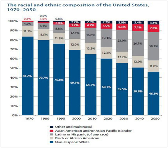
Immigration is the engine of increased racial and ethnic diversity in all contemporary nation-states. By stimulating a steady influx of immigrants from Africa, Asia, and the Americas, the Immigration and Nationality Act of 1965 transformed the racial and ethnic composition of the United States. A common refrain in American political discourse is that “diversity is our strength.” However, racial and ethnic “diversity married to a heightened consciousness of race, language, religion, or group culture poses challenges to national unity.” While sanguine Pollyanas say that the country has been through all of this before and that the experiences of today’s immigrants will, in the end, resemble those of their European predecessors in the American melting pot, gloomy Cassandras worry about the creation of a balkanized public spurred on by the death of national commitment to e pluribus unum.
Graph #5: Age

Increasing levels of immigration are one way to deal with the problems posed by an aging population. The United States is in need of such solutions because it is getting older quickly. The number of elderly (65+) Americans is predicted to reach 80 million by 2040, a four-fold increase since 2000. Because older people are less likely to work and contribute to the pool of taxes that finance Medicare, Social Security, and all other public-sector activities, population aging will likely place fiscal strain on states and the federal government. The fact that many of these older Americans are putting off retirement (see, for example, the political gerontocracy constituted by Nancy Pelosi, Steny Hoyer, Jim Clyburn, Stephen Breyer, Joe Biden, Dianne Feinstein, Mitch McConnell, and Donald Trump) has also created “a multigenerational traffic jam on the upper rungs of America’s career ladder.”
Graph #6: Life Expectancy
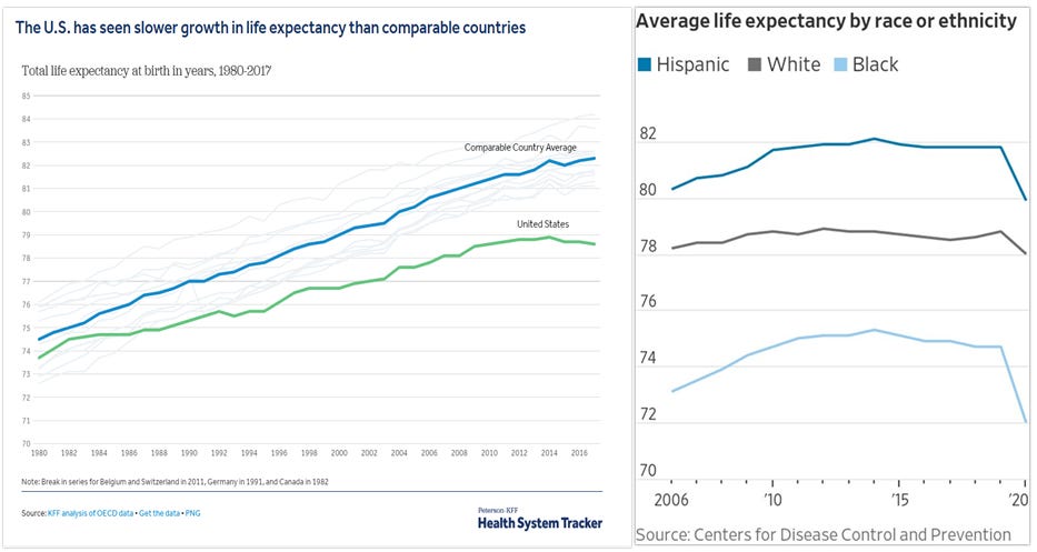
The country’s population is aging, in part, due to the fact that people typically live longer than they did fifty years. After a period of slow and fairly steady growth, however, life expectancy in the United States has entered into a steep decline. Between 2019 and 2020 alone, the nation’s life expectancy at birth dropped by 1.5 years, the largest one-year decline since World War II.
Graph #7: Smoking
![Poll: U.S. Smoking Rate Falls To Historic Low [Infographic]](https://substackcdn.com/image/fetch/f_auto,q_auto:good,fl_progressive:steep/https%3A%2F%2Fbucketeer-e05bbc84-baa3-437e-9518-adb32be77984.s3.amazonaws.com%2Fpublic%2Fimages%2Fe30f6b63-94b5-46d8-9e86-7be2b8f973ba_960x684.jpeg "Poll: U.S. Smoking Rate Falls To Historic Low [Infographic]")
The shorter lives of Americans are not a function of universally worse lifestyle choices. Nearly half of all Americans were cigarette smokers in the early 1970s. Smoke and smoking were ubiquitous in public and private places throughout the 50s, 60s, 70s, and 80s. In fact, it was not until 1995 that California became the first state to ban smoking in the workplace, including public buildings, indoor workspaces, and restaurants. The decline in smoking since then strongly suggests that the consistent enforcement of social norms through shaming, coupled with public policies raising the costs of disfavored choices, can dramatically reduce the incidence of harmful behaviors. Importantly, however, this social and political pressure has been only selectively applied to a narrow number of behaviors connected with public health and well-being.
Graph #8: Obesity
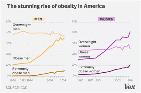
In 1970, more than 40% of Americans smoked and 15% were obese. Now, 15% of Americans smoke and 40% are obese. According to data from the Centers for Disease Control and Prevention, the average American man’s weight increased by 15 pounds and the average American woman’s weight increased by 17 pounds between 1994 and 2014. The causes of growing obesity are many and varied but the federal government’s dietary guidelines have not helped. By attempting to convince Americans to limit their fat intake, the government’s recommendations led to diets with less fat and more carbs. This change is at least partly responsible for the dramatic rise in the nation’s obesity rates.
Graph #9: Autism
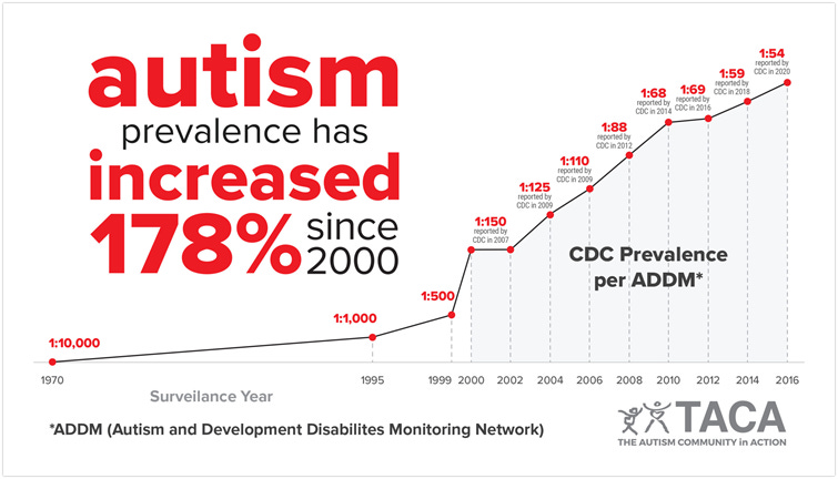
Autism is a developmental disability that causes significant social, communication, and behavioral challenges. The latest CDC report estimates that 1 in 44 children have autism in the United States, indicating an almost incalculable increase from 1970 (when 1 in 10,000 children were diagnosed with the condition). There is no consensus on the causes of this increase. The best answer the CDC can offer at this point is that there are “many different factors that make a child more likely to have an ASD, including environmental, biologic and genetic factors” Like other health-related issues, the costs associated with autism are staggering. Between 1990-2019, autism cost the United States an estimated $7 trillion dollars.
Graph #10: Depression and Anxiety
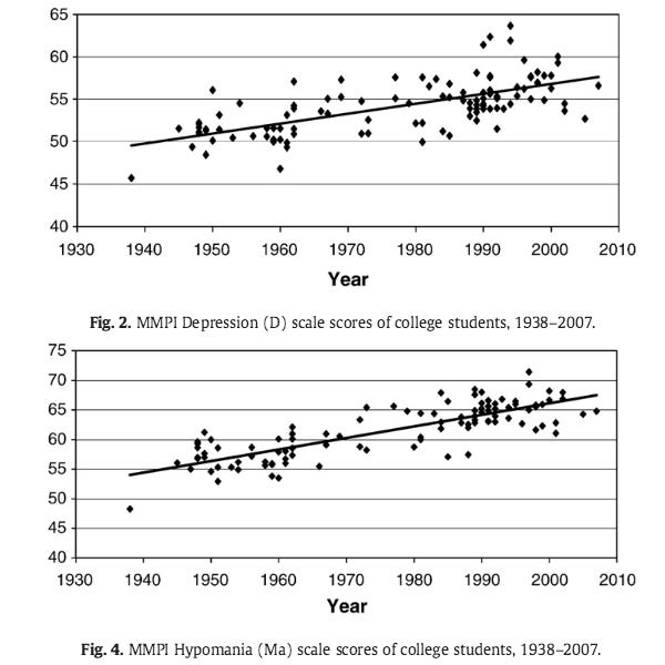
The historical data here about mental health in the United States are somewhat harder to come by than statistics on other kinds of maladies. From the limited data we do have, however, it appears that young Americans have been getting more anxious and depressed over the last 50 years. Why young people are experiencing these mental health struggles is anyone’s guess. The usual suspects are a decline in social connectedness, marriage, and religiosity (all discussed below). Regardless of these speculations, however, the past was apparently a thinner, healthier, and happier place.
Graph #11: Who is Depressed?
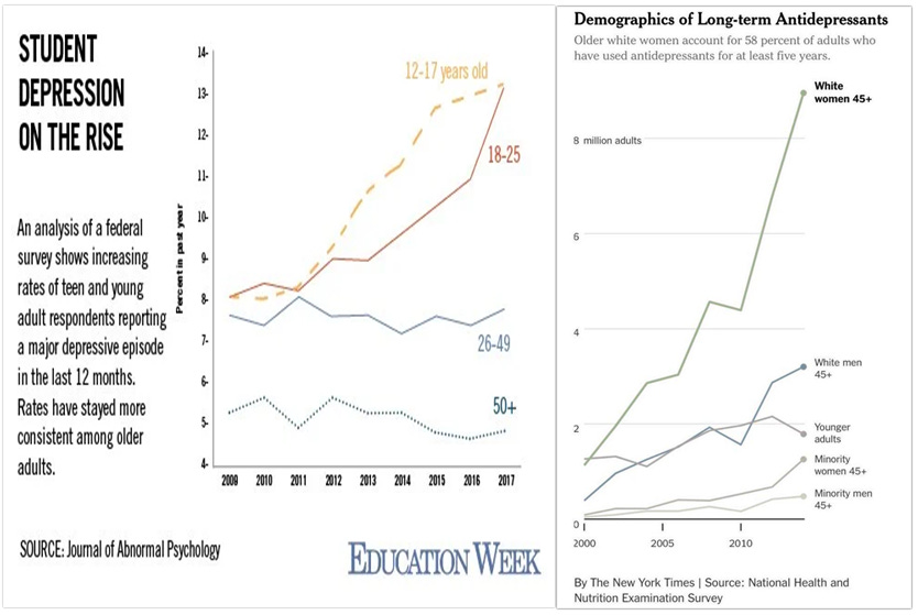
Not everyone has been similarly subjected to mental health struggles. Nearly 15% of Americans between the ages of 12 and 25 reported experiencing a major depressive episode in 2017 and more than 8 million white women over 45 were on long-term antidepressants in 2019. Things have gotten much worse in the last few years, particularly for the country’s young people. The toxic combination of constant social media exposure and COVID’s policy interventions (e.g. masking requirements, lockdowns, social distancing, quarantining, etc.) have supercharged rates of depression, anxiety and self-harm among teenagers. The last two years have been a “perfect storm” of mental health challenges for the nation’s young people and they have not weathered it well.
Graph #12: Happiness

Since 1972, the General Social Survey has asked respondents the following question: “Taken all together, how would you say things are these days--would you say that you are very happy, pretty happy, or not too happy?” There has been surprisingly little change in the distribution of “happiness” in the public over the last fifty years, with the “very happy” outnumbering the “not too happy” crowd by about three-to-one. In 2021, however, things changed. For the first time in the survey’s history, the number of “very happy” Americans dropped below the number of “not too happy” Americans. Unhappiness increased among nearly every part of American society - with Democrats and Republicans, men and women, rich and poor, healthy and unhealthy people all reporting less happiness. COVID is not the only pandemic afflicting American society.
Graph #13: Deaths of Despair
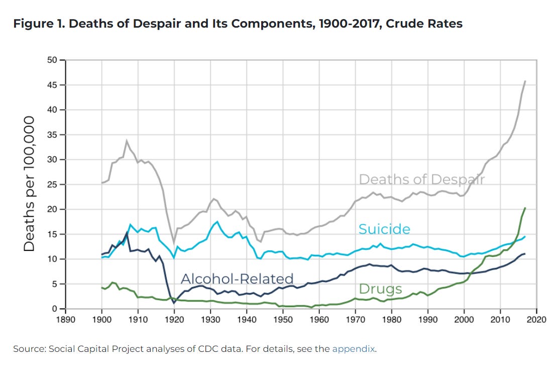
According to Oxford Languages’ dictionary, “despair” refers to “the complete loss or absence of hope.” In the United States, deaths plausibly associated with a profound sense of hopelessness - as measured by the number of drug overdoses, suicides, and alcohol-related issues - are skyrocketing. For example, the most recent release from the CDC reported more than 100,000 drug overdose deaths during the 12-month period ending in April 2021 (a 28.5% increase from the previous year). A combination of vanishing economic opportunities, disintegrating families, hollowed-out communities, and, more recently, COVID-related stressors has unleashed a rising tide of fatal despair that is leading more Americans to drink themselves to death, accidentally overdose on opioids, and kill themselves, often by shooting or hanging. Though demographic disparities in “deaths of despair” have narrowed somewhat in recent years, white, working-class men between the ages of 45 and 54 have been particularly susceptible to suicide and overdose death since 2000.
Graph #14: Religion
 are statistically the same size as evangelicals (22.8%). There was also")
The growth of the “nones” (referring to those who claim to have no affiliation with any religion) in American society has been dramatic. In 1972, just 5 percent of Americans claimed to have “no religion.” In 2018, that number rose to nearly 24% percent, making the “nones” as numerous as both Catholics and evangelical Protestants. Sometime within the next 10 years, the “nones” will almost certainly become the largest “religious” group in the United States. Yet, it is not at all clear that less Catholicism and Protestantism means that Americans have given up on faith-based living. As Musa al-Gharbi writes, “Unmoored from religious tradition, many [Americans] reach for political fundamentalism to provide a sense of identity and purpose for their lives, and pursue political activism as a means of engaging in fellowship with like-minded believers.” The most conspicuous example of this quasi-religious, “political fundamentalism” is the “Great Awokening” taking place among highly educated white liberals.
Graph #15: Marriage

The nation’s major religious traditions each emphasize the importance of marriage. Perhaps it’s unsurprising, then, that our new, predominantly secular country is a country in which we are waiting longer and longer to get married. In 1962, half of 21-year-olds and 90% of 30-year-olds had been married at least once. In 2019, only 8.0% of 21-year-olds and 51.2% of 30-year-olds had been married.
Graph #16 : Marriage and Class

Prior to the 1970s, there were not large education or income gaps in the structure of American families. The overwhelming majority of Americans got and stayed married. As a result, most American children lived in stable, two-parent families. In modern America, however, class divides have widened and the rich and poor live fundamentally different family lives. Affluent, college-educated Americans of all races enjoy stable marriages and the economic and social benefits that flow from such marriages. By contrast, poor and working-class Americans experience rising rates of family instability, single parenthood, and life-long singleness. These Americans pay an almost immeasurable set of economic, social, and psychological prices for the fragility of their families. To take just one of the most easily identifiable consequences, the concentration of marriage among the richest Americans is responsible for a significant part of income inequality in the United States (see below). Regardless of the consequences, however, in the United States today, “Marriage is for rich people.”
Graph #17: Fertility Rate

In addition to waiting longer to get married, Americans are having fewer children. The reasons behind the declining fertility rate are complicated. Some point to the delay in marriage (see above). Others highlight the change in labor force participation among women (see below). Still others emphasize problems related to conception. Regardless of its causes, the United States’ low fertility rate (<2) means that it cannot maintain its population size without net positive immigration (a development that brings its own assorted challenges).
Graph #18: Marriage and Children
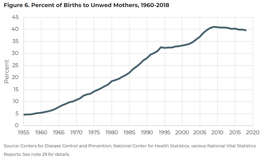
When American women do give birth, they are increasingly doing it outside of marriage. In 1970, only 1 in 10 American children were born out of wedlock. Currently, nearly 4 in 10 are. The U.S. now has the world’s highest rate of children living in single-parent households. This aggregate picture, however, distorts the massive class (see above) and racial and ethnic differences in how American kids are growing up. Nearly 85% of Asian American children, 75% of white children, and 62% of Hispanic children grow up with married parents in the house. By contrast, only 36% of African American children do. Any serious discussion of racial inequality in the country must contend with the causes and consequences of these differences in family structure.
Graph #19: Friendship
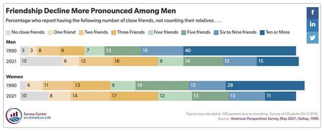
Not only are Americans increasingly unmarried and childless, but they are also increasingly friendless. In 1990, 40% of men and 28% of women reported having ten or more friends. Less than 3% of Americans were without any close friends. Now, only 12% of Americans report having more than ten friends, and 12% have no close friends at all. While men may be dealing with this loneliness by anesthetizing themselves with video games and porn, women are increasingly turning to social media obsession, medication, and forms of self-harm. In the space of only three decades, America’s once notoriously deep and rich social networks have become shallow and impoverished.
Graph #20: Living Arrangments
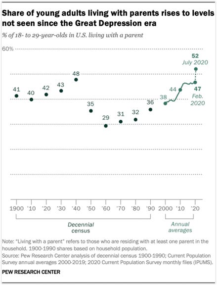
With no friends and no spouses, Americans are remaining at home with their parents. More than half of “young people” (18-29-year-olds) were living with their parents in 2020. While COVID has accelerated the trend of younger Americans retreating back to their childhood homes (or “failing to launch” in the first place), it is not wholly responsible for it. The number of young people residing with their parents has increased every decade since 1960.
Graph #21: Sex
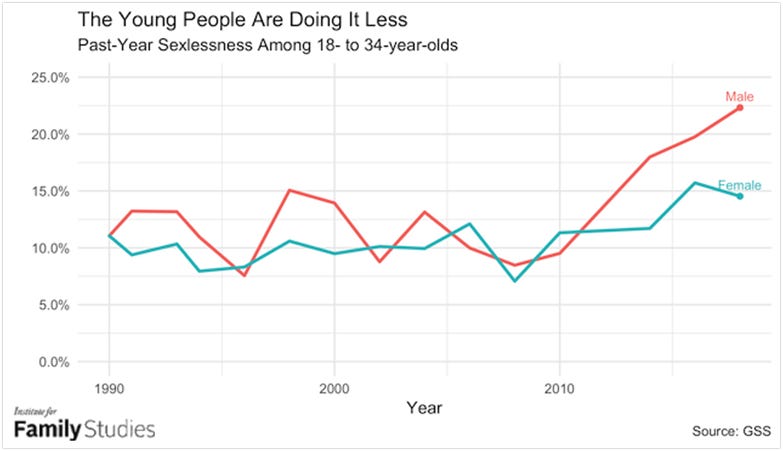
Having few friends and little privacy in their homes due to sharing a bedroom wall with their parents, it’s probably unsurprising that young people are having less sex. Between 2010 and 2018 alone, the number of men going “sexless” for the last year more than doubled from 10% to 25%. The growth in this segment of the American public has spawned entire subcultures on the Internet, including communities where “incels” (involuntary celibates) meet to discuss their collective struggles. While many of these online communities have turned toxic, their existence represents an almost inevitable consequence of the growing isolation of young American men. Contrary to the expectations of many, rather than expanding dating opportunities for even the most reclusive Americans, the rise of online dating applications has actually exacerbated inequalities in sexual activity. On Tinder, for example, 80% of women compete for the top 20% of men while the rest of men are completely ignored.
Graph #22: Education
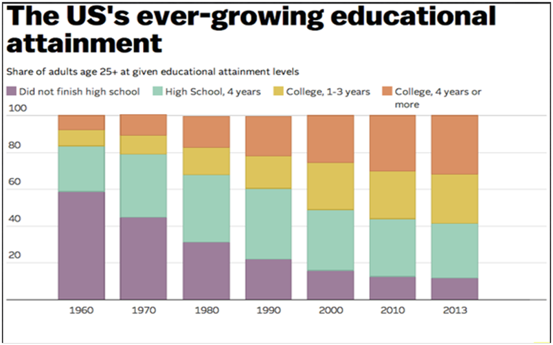
High school diplomas have become nearly universal in the United States. In 2013, 88% of adults ages 25 and older had at least completed high school, a massive increase from the 57% of adults who had at least finished high school in 1970. Now, nearly 40% of Americans have college degrees. The growing importance of higher education has created the unfortunate situation where the cost of a college degree is going up (see below) but the (relative) value is going down. This dynamic has undoubtedly fueled calls to make college “free” and forgive all student loan debt. More importantly, it is responsible for the “elite overproduction” that might be responsible for knocking the United States’ liberal democracy out of “tune.”
Graph #23: Education and Gender
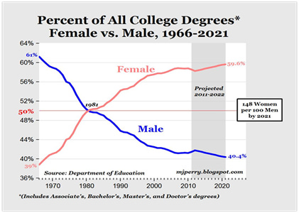
Not everyone, however, is equally likely to pursue a college degree. Women are far more likely to enroll, attend and graduate from college than men. Women currently earn a majority of degrees in every field except for Business, Architecture, Math and Statistics, Physical Sciences, Engineering, and Computer Science. The disparity between men and women is particularly strong in Public Administration, Psychology, and Education, where women earn roughly 80% of all degrees. The lack of a college education predisposes men to disproportionately suffer from a nearly endless list of pathologies, including homelessness, suicide, addiction, incarceration, death on the job, and victimization from violent crime. As Andrew Yang recently wrote in the pages of the Washington Post, “The Boys Are Not All Right.” Perhaps due to their poor fit with existing narratives about gender and inequity, these problems receive vanishingly little attention from activists, policymakers or news organizations. What to make of these differences and what (if anything) to do about them remain unsettled questions.
Graph #24: Education and Race
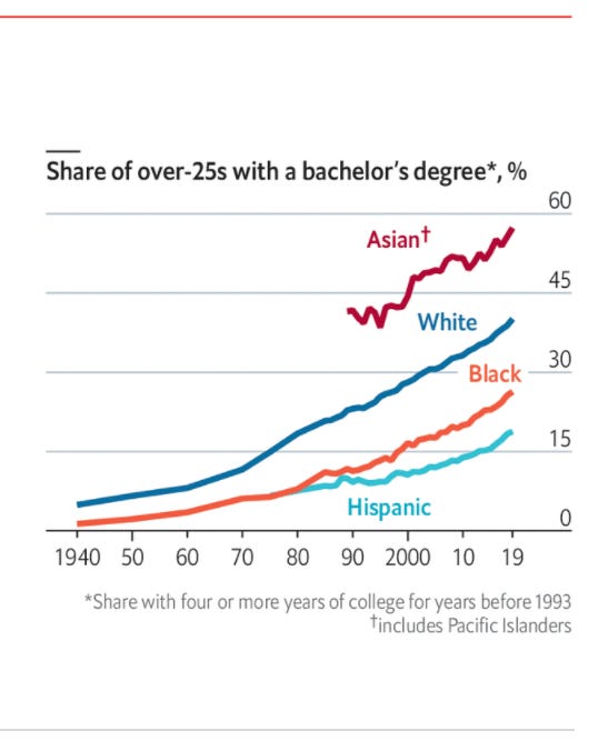
Despite the fact that rates of college graduation have increased significantly for nearly every subgroup in the United States, disparities across racial and ethnic groups persist. Most discussions of racial and ethnic disparities in degree-holding fixate on the black-white gap. While whites over the age of 25 are, in fact, more likely than similarly aged blacks to have a bachelor’s degree (36% to 23%), the gap in educational attainment between blacks and whites has narrowed considerably since 1980. The focus on skin color also obscures the fact that black immigrants from Africa are more educated, on average, than whites (43% to 36%). More importantly, the preoccupation with black-white comparisons ignores the fact that the largest disparity is between Asian Americans and everyone else. Well over half of Asian Americans over the age of 25 hold a college degree.
Graph #25: SAT Scores

More Asian Americans earn college degrees because more Asian Americans are well-prepared for college. Scores on the most important measure of college readiness - the SAT - show an increasingly yawning gap between Asian Americans and everyone else. In the late 1990s and early 2000s, there were no significant differences between Asian Americans and whites with respect to average SAT scores and the gap between Asian Americans and blacks was less than 200 points. By 2019, however, Asian Americans were outscoring whites by an average of 109 points, Hispanics by an average of 245 points, and blacks by an average of 290 points. Asian American dominance in the SAT has created massive problems for the nation’s elite universities (who increasingly define racial and ethnic representation as one of their primary institutional goals). Faced with the possibility of accepting freshmen classes that are 30% to 40% Asian American, some universities have decided to reformulate their admissions policies in ways that systematically discriminate against Asian Americans in favor of black and Latino applicants. In one recent study of Harvard admissions, for example, a hypothetical male applicant’s chance of admission at Harvard would increase from 25% if they were Asian American to 95% if they were African American (holding all other qualifications constant). In another study of admissions among a broader pool of elite universities, Asian Americans were estimated to need an SAT score 270 points higher than a Hispanic applicant and 450 points higher than an African American applicant to have the same chance of admission. Rather than confront the increasing embarrassment of denying Asian Americans with vastly superior SAT scores than other applicants, most universities are simply dropping the SAT as part of their admissions process.
Graph #26: Peer Review
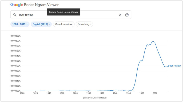
The ever-growing number of college students over the last 50 years has meant an ever-growing number of faculty members in an ever-growing number of “disciplines” attempting to publish research in an ever-growing number of “peer-reviewed” journals. The glut of research pouring out of universities since the 1960s has replaced problems of “information scarcity” (i.e. there is little to no good evidence on any given topic) with problems of “information abundance” (i.e. there are countless and often contradictory studies on any given topic). Driven by an almost religious commitment to supporting only “evidence-based policy” solutions but limited by their nearly complete lack of domain-specific expertise on most matters, the country’s chattering class has elevated process over substance as an epistemological standard (i.e. a particular piece of evidence is now believed not because it makes sense or provides insight into an important problem but, instead, because it went through a process of “peer-review”). While this peer-reviewed based “process epistemology” (illustrated above by the sharp increase in references to the phrase in published books) is enormously valuable for lay observers when peer-review processes are neutral, fair, and efficient, it becomes a catastrophe when peer-review processes become biased, politicized, and inefficient. It is particularly concerning, for example, faculty and graduate students are overwhelmingly liberal and are willing to discriminate based on politics in academic decision-making. Organizations like Heterodox Academy attempt to call attention but many are hopeless and suggest peer-review is broken in ways that cannot be fixed.
Graph #27: Labor Force Participation
One of the most dramatic and consequential changes in American society has been the increased participation of women in the workforce. Over the last 50 years, labor force participation by women has grown more than 30%. It is important to keep in mind here also that roughly one-third of men are currently either unemployed or out of the workforce completely. Now, more than half of American households now have a woman as the primary breadwinner.
Graph #28: Unions
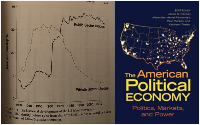
The story of unions in recent American history is complicated. Private sector unions have been obliterated over the last five decades, falling from 30% of the American workforce in 1970 to a mere 6% today. The decline in private-sector unions is a likely contributor to rises in inequality of all sorts, ranging from income to political influence. It has also deprived Americans of an important means of cross-racial community building. By contrast, membership in public-sector unions has consistently been about one-third of employees since the 1970s. The continued strength of public sector unions, including those of teachers and police officers, and the perception that they thwart meaningful reforms in the public’s interest contributes to growing cynicism towards government (see below).
Graph #29: Hours Worked
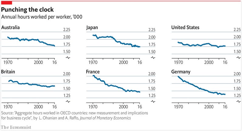
Citizens of most advanced industrialized democracies are working much less than they did in 1970. This is not true, however, for Americans. Despite gains in productivity and relatively flat wages (see below), Americans still clock roughly the same number of yearly hours at work that they did forty years ago.
Graph #30: Income
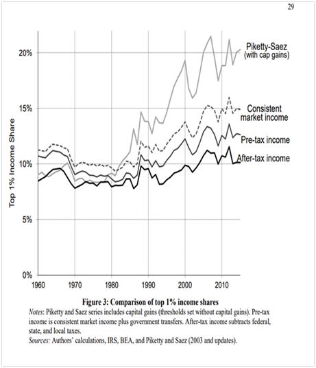
The vast majority of Americans believe that income inequality has exploded since the 1970s. This conventional wisdom is based largely on the work of economists Thomas Piketty and Emmanuel Saez. Using tax data instead of survey data, Piketty and Saez were able to track, for the first time, the incomes of the very wealthy and compare them to those of the less well-to-do. The results of their 2003 study, showing that the top 1% of the country more than doubled their share of national income since 1970, provided the Obama White House with an empirical rationale for its tax policy and provided the Occupy Wall Street movement with its basic vocabulary. Reconsiderations of their work, however, have suggested a more nuanced story. Once changes in household size connected to marriage rates, taxes, in-kind transfers from employers, and government payments are taken into account, increases in income inequality look far less pronounced (see, for example, the above graph comparing Piketty and Saez’s initial estimate of the top 1%’s income share with capital gains to the revised “after-tax income estimate). Nevertheless, perception is often reality in politics and the perception of most Americans is that the 1% are making out like bandits at the expense of the 99%.
Graph #31: Income by Race

A different way to think about income inequality is in racial and ethnic terms. The relative standing of Asian Americans, whites, Hispanics, and African Americans has not changed at any point since we started tracking incomes by race. It is popular to object to some (but not all) racial and ethnic categorizations on the grounds that such “lumping” obscures more than it reveals due to the diversity of national origin groups that constitute the broader racial or ethnic category. These objections are particularly pronounced at the moment for “Asian Americans.” With respect to income, however, Asian Americans are not actually all that diverse. Almost all Asian American national origin groups have higher incomes than the national median. For whites, Hispanics, and African Americans, however, there is tremendous variation in income based on national origin. Consider, for example, the fact that Nigerians are “The Most Successful Ethnic Group in the U.S.” These data cast serious doubt on the idea that persistent disparities between racial and ethnic groups necessarily reflect the kinds of discrimination so frequently emphasized in contemporary American political discourse.
Graph #32: Wealth
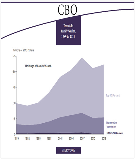
Wealth refers to the value of assets owned by a family, such as a home or a savings account, minus outstanding debt, such as a mortgage or student loan. Accumulated over time, wealth protects against short-term economic shocks, serves as a source of income during old age and provides security and social status for future generations. Most observers agree that wealth is much more highly concentrated than income and, importantly, that the concentration of wealth in the hands of a small number of Americans has increased over the last 35 years. The best survey data show that the share of wealth held by the top 1 percent rose from 30 percent in 1989 to 39 percent in 2016, while the share held by the bottom 90 percent fell from 33 percent to 23 percent. There are large racial and ethnic disparities in wealth that appear to be getting worse over time. Interestingly, however, the bottom 75% of whites have identical wealth levels and over time dynamics as the full Black population. A relatively small group of elite white people, in other words, is becoming wealthier while everyone else (including the vast majority of whites) is not.
Graph #33: Productivity and Compensation
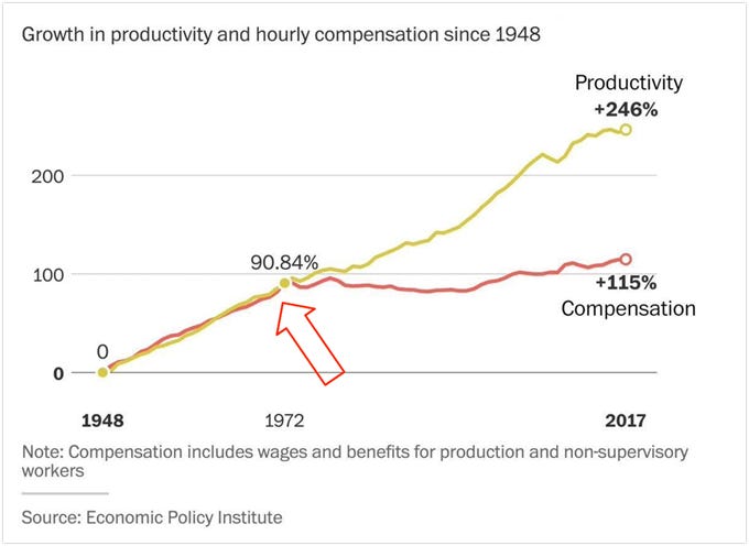
Productivity measures how much total economywide income is generated (i.e., for workers, business owners, landlords, and everybody else together) in an average hour of work. As productivity grows and each hour of work generates more and more income over time, it creates the potential for improving living standards across the board. This potential for higher standards of living need not be realized, however, if compensation for workers does not increase along with productivity. Between 1948 and 1972, compensation for worker workers climbed together with productivity. After 1972, the compensation and productivity become completely uncoupled. Where did all the income growth associated with increases in productivity go? It went into the salaries of highly paid corporate and professional employees and into higher profits (i.e., toward returns to shareholders and other wealth owners).
Graph #34: Price Changes
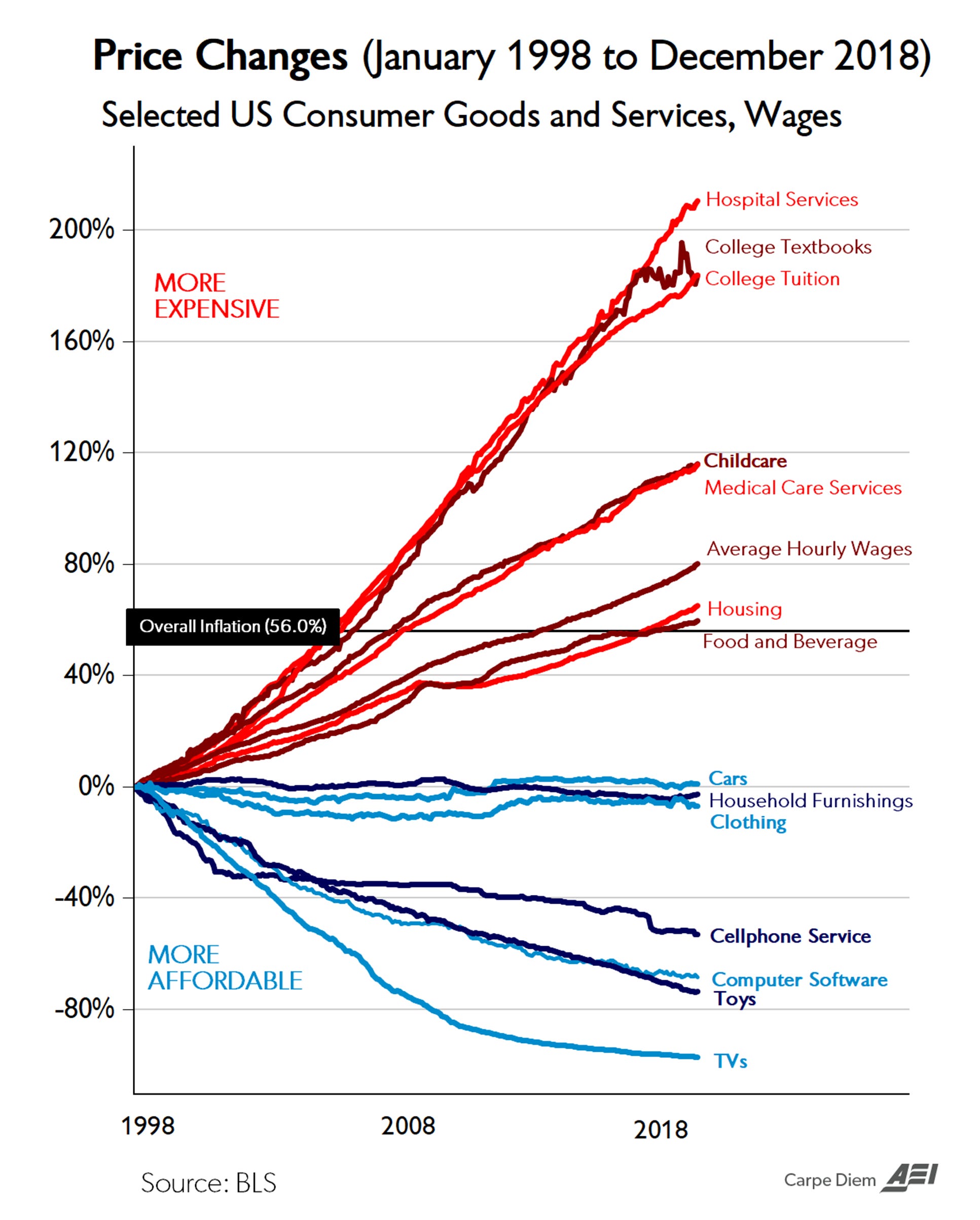
Flat incomes tell only part of the story of the standard of living in the United States. Generally speaking, the prices of goods subject to intense (usually foreign) competition, such as toys, television sets, and other consumer goods have declined dramatically over the past two decades as trade barriers have come down around the world. By contrast, prices of so-called non-tradeables, most notably housing, health care, child care, and college tuition costs, have surged. As Sociologist Joseph Cohen of Queens University has said, “America is a place where luxuries are cheap and necessities costly.” Or, put differently, it’s increasingly the case that we can afford the things we don’t need, but we need the things we can’t afford.
Graph #35: Prison Population

Much has been made of “mass incarceration” in the United States and its connection to race. Despite constituting five times more of the overall population, there is roughly the same number of whites in state and federal prisons as African Americans (approximately 450,000). While most Americans assume that size, growth, and composition of the country’s prison population is entirely a function of the war on drugs, 4 out of 5 people in prison or jail currently are locked up for something other than a drug offense. Additionally, there is little evidence that Americans are committing more violent crimes than citizens of other rich countries. These two facts lead some observers to conclude the United States has a sentencing problem more than a crime problem. Reformers to the system, therefore, often advocate for shrinking the population of incarcerated people by ending mandatory minimums. Such efforts are likely to fail given that most Americans believe that crime rates are skyrocketing.
Graph #36: Murder Rate
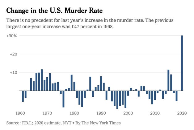
The public’s perception of rising crime rates is obviously (but imperfectly) related to the vast increase in murders since 2020. There were a staggering 21,570 homicides in the U.S. in 2020 (up from “only” 16,669 in 2019). It is popular at the moment to feign confusion about the causes of this spike in the murder rate. Some say that COVID could have led to more violence by leading to the shutdown of social programs that could have prevented murders, or by eliminating the job or education opportunities that keep young people out of trouble. A far more likely culprit, however, is what some have called the ‘Ferguson Effect 2.0,” the generalized retreat from proactive policing in major cities around the country in the wake of George Floyd’s death. Those looking for a glimmer of good news might point out that the increase in murders has occurred alongside a decline in other violent crimes and property crimes. It is hard to see much light, however, through the darkness of 5,000 additional murders.
Graph #37: Gun Ownership
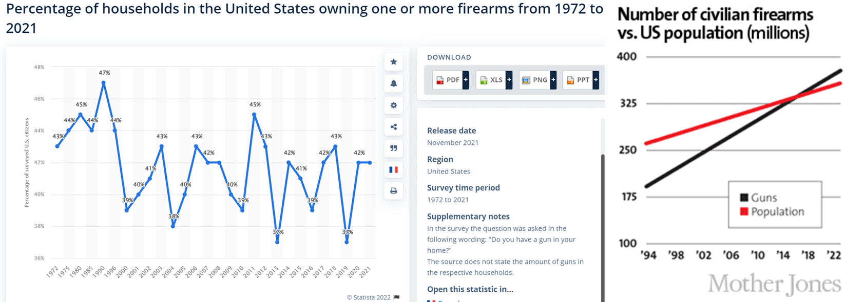
Murdering people is easier when you have guns and there is no shortage of guns in the United States. In order to understand the issue of the country’s guns, however, it is important to acknowledge two things about gun ownership: (1) most Americans (68%) do not own a gun or live in a household with a gun but (2) there are more guns than people in the United States (approximately 400 million compared to 340 million). The ubiquity of firearms sets the United States apart from other countries, contributing to its relatively high homicide and suicide rates as well as complicating the job of law enforcement officers. Some work even suggests that the decline in life expectancy in the United States (see above) might be due entirely to guns.
Graph #38: Internet Usage
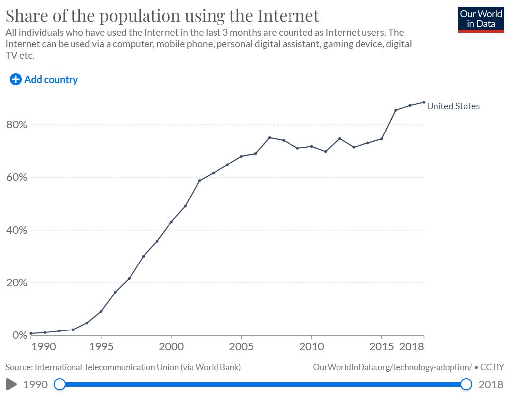
Building on email and file-sharing technology from the 1960s and 1970s, the “world wide web” was created in 1989. The first website (http://info.cern.ch/hypertext/WWW/TheProject.html) went live on August 6, 1991. In the three decades between then and now, the Internet has gone from being used by roughly no one for anything to used by nearly everyone for everything. The Internet is now so large, diverse, and all-consuming that anything that can be said about the Internet will necessarily be true (and so will the opposite).
Graph #39: Mobile Phone Subscriptions

Much like guns, there are now more mobile phones than people in the United States. Although the overwhelming majority of Americans had cellphones by 2007, the social, political, economic, and cultural impact of mobile phones was probably limited before the combination of the iPhone and social media made continuous consumption and communication nearly inescapable. According to Jonathan Haidt and Jean Twenge, “the smartphone brought about a planetary rewiring of human interaction.” Currently, roughly half of young Americans (18 to 29 years old) are online (through their mobile phones) “almost constantly.” Perhaps unsurprisingly (see above), the advent of the smartphone era has corresponded with massive increases in mental health problems, suicides, and social isolation.
Graph #40: Newspaper Circulation
 Circulation and Revenue Figures for Newspapers - Baekdal Plus")
The dramatic growth of the Internet has coincided with the dramatic decline of the newspaper industry. The collapsing business model of newspapers is a combination of diminishing advertising revenue (the frequently discussed “trading of analog dollars for digital dimes” that resulted from competition with Facebook and Google’s superior advertising products), cratering classified ad revenue (the oft-cited “Craigslist problem”) and sagging subscription revenue. There’s some debate over whether the “death of newspapers” has led to the “death of journalism.” What is not debated, however, is that the old media world defined by high levels of local newspaper readership is gone and never coming back.
Graph #41: Newspaper Coverage
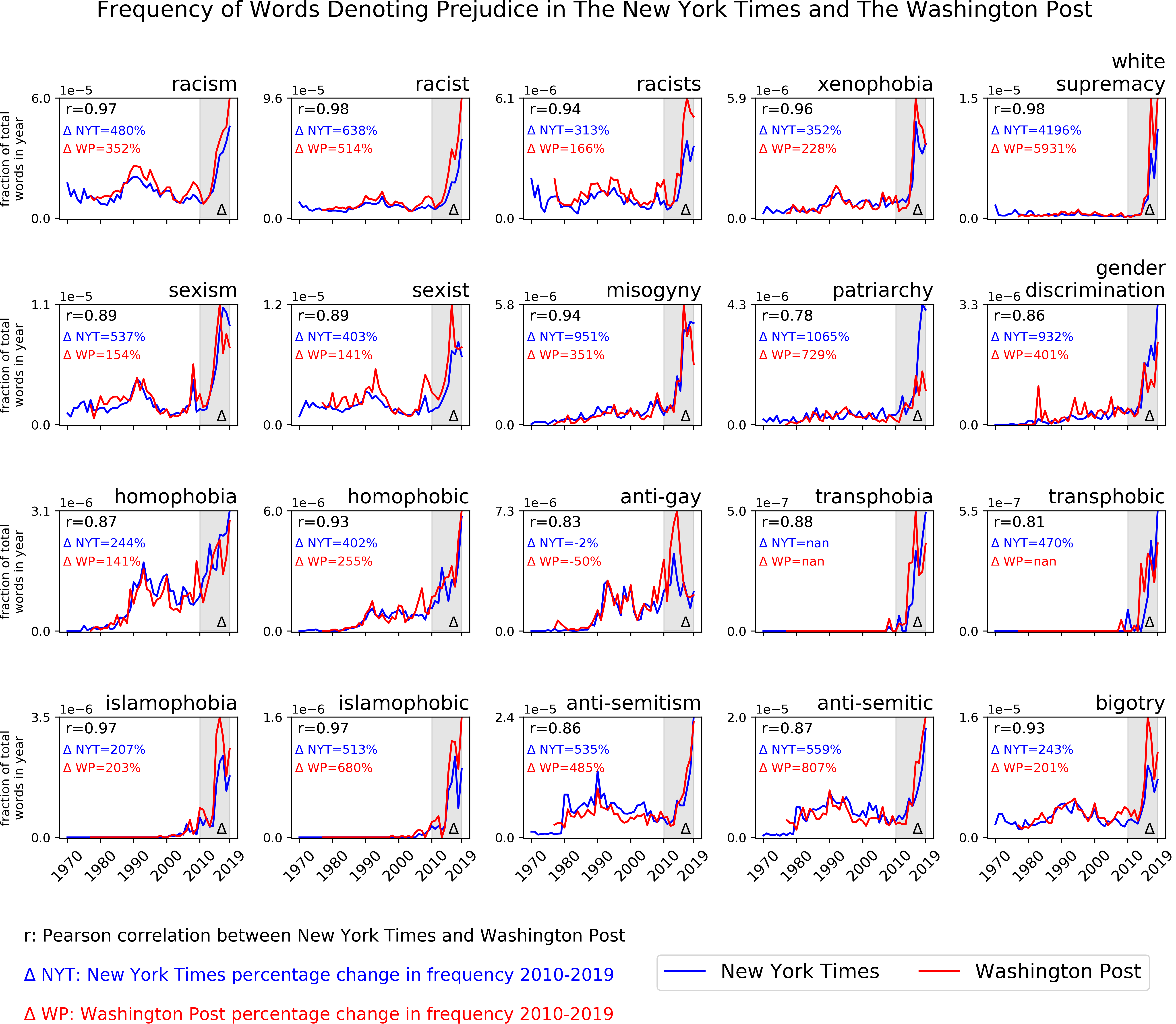
As newspapers have had to chase down “digital dimes,” they have drifted away from “objectivity” and “neutrality” as guiding professional values and focused, instead, on crafting coverage that appeals to narrower and narrower (usually ideologically-defined) audiences. This drift, pushed along by an overwhelmingly white, highly educated, urban, and wealthy press corps that is deeply ensconced in a perception-distorting political and geographical bubble), has led to the marked increase in the prevalence of prejudice-denoting words in the nation’s elite newspapers between 2010 and 2019. The fact that this new obsession with identity-based inequities has coincided with declines in overt expressions of prejudice and relatively constant levels of inequality suggests that news standards have profoundly changed in very short order. Perhaps most importantly, these changes in the tone and substance of news coverage have likely reduced media trust (see below), increased political polarization and paved the way for social movements (such as Black Lives Matter and MeToo) centered on identity. To paraphrase, the title of Nikki Usher’s book on the producers and consumers of American media, we now have a “News Media for (and by) the Rich, White, and Blue.”
Graph #42: Pages in the Federal Register

The Federal Register is a daily journal of federal government activity that includes presidential documents, proposed and final rules, and public notices. The regulations included in this measure might increase or decrease regulatory burdens, making this an imperfect - but frequently cited - measure of regulatory burden. Despite long periods of unified Republican control over the federal government, regulatory burden, government spending, and the national debt (see below) have consistently increased since 1970. Although this is probably connected with “cost disease” and the political infeasibility of actually cutting government programs (rather than reducing revenue through tax cuts), it has likely driven Republican voters in the direction of populism by leaving them with the sense that Republican politicians never follow through on their promises to reduce the size and scope of the federal government.
Graph #43: National Debt

The national debt is a measure of how much the federal government owes its creditors. The national debt hit $30 trillion for the first time ever on Jan. 31, 2022. While this number is staggering (more than $90,000 per person in the United States), the ratio of debt to gross domestic product tends to be a greater focus for economists and policymakers than the overall dollar amount of debt. Since 1970, when the federal debt held by the public stood at about 27% of GDP, debt has gone through a few different periods, staying fairly steady through the 1970s, rising drastically through the 1980s and early 1990s under the Reagan and Bush Presidencies before leveling out during the Clinton administration. The debt-to-GDP ratio started climbing under former president George W. Bush again, slowly at first, and then sharply. It hasn’t abated since then and now stands at 123%. Political disagreements about the impact of national debt and methods of debt reduction have recently led to many gridlocks in Congress and delays in the budgetary process. Debt is likely to be an increasingly salient political issue in the coming years.
Graph #44: The Gender Composition of Government

Women were nearly non-existent in government five decades ago. Currently, women constitute at least 25% of United States Cabinet-level positions, the United States House Representatives, the United States Senate, state-level senates, state-level assemblies, statewide elective offices, and city-level mayorships. The reasons behind the consistent underrepresentation of women in political office are well-documented and, to the surprise of many, have more to do with the fact that women are less likely to run in the first place than with differential treatment by the media, campaign donors or voters. The myriad political impacts of this sea change in government’s composition, however, are only beginning to be theorized, cataloged, and investigated. Recent research has shown that policy outcomes are significantly different in contexts with more gender-balanced decision-makers and that higher-profile women in government can spark increased political efficacy, trust, and participation among women in the public. More controversially, some have argued that the growing number of women in politics have contributed to changes in the informal rules and norms that govern public discourse.
Graph #45: Institutional Trust
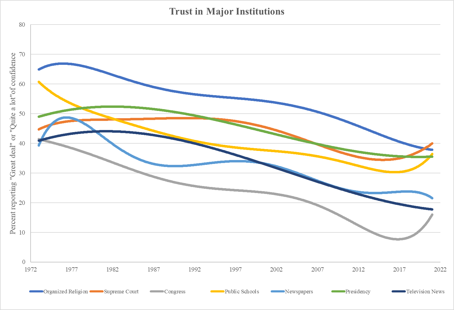
Americans simply don’t trust their institutions anymore. Trust is relational and domain-specific. In other words, Actor #1 trusts Actor #2 to do thing X. “Government trust,” for example, might be understood as the public’s confidence that the government will deliver “good policy, peace, and sound economic stewardship.” Similarly, “media trust” might refer to the public’s confidence that the newspapers and television stations will deliver timely, accurate, unbiased, and contextually relevant information. With the exception of a few temporary upticks here and there, the last five decades have seen a relatively steady decline in the American public’s trust in most of its major institutions. According to Gallup, Americans’ average confidence in organized religion, public schools, newspapers, television news, Congress, the Presidency, and the Supreme Court has dropped from more than 45% in the 1970s and 1980s to a mere 27 percent today. Political distrust is not only communicated through surveys, however. The populist outbursts beginning in 2016 provide more tangible indicators of the dangerously low and dramatically declining levels of political trust in the United States. At their core, populist movements are a revolt of the people against “the elite.” Whether they emerge from the left or the right, populist movements are fundamentally anti-institutional in nature, seeking to circumvent, undermine and replace the influence of experts with the wisdom of the common citizen. Aspiring populists in contemporary American politics need not worry about doing the difficult work of conjuring up hostility towards the country’s elites. Instead, they can merely tap into our deep and expanding reserves of pre-existing distrust.
Graph #46: Free Speech
Liberalism refers to a political system that “constrains the power of government” and “recognizes the equal dignity of every human being by granting them rights that protect individual autonomy: rights to speech, to assembly, to belief, and ultimately to participate in self-government.” Studies from the 1950s, 1960s and 1970s found that large majorities of the American public, community leaders, scholars and legal practitioners strongly endorsed the liberal principles embodied in the First Amendment. This liberal consensus, however, has begun to unravel in the face of arguments that racist slurs, epithets, and other expressions that demean social identities are an intolerable affront to egalitarian values and do immeasurable harm to historically marginalized groups. Most importantly, political tolerance’s traditional relationship with ideology, education and age have diminished or completely reversed. As Chong, Citrin, and Levy argue, “In a stunning reversal,” highly educated, young liberals “are now consistently less tolerant than conservatives of a wide range of controversial speech about racial, gender, and religious identities.” As highly educated liberals, with their new standards for political tolerance, have taken over journalism and academia, an increasingly broad spectrum of speech - ranging from scientific inquiry to novel writing - has come under scrutiny. There are now profound questions about the scope of permissible debate in contemporary American politics.
Graph #47: Ideological Polarization

The United States is now a deeply divided society. One way of tracking the depth of this division is to examine changes in ideological polarization. Since 1970, the Democratic and Republican parties have become more internally homogenous and further from each other on questions related to the basic size and scope of government. The differences between the parties have become particularly pronounced over the last ten to fifteen years. While most left-leaning narratives suggest that polarization is “asymmetric,” with the differences between being driven entirely by the increasingly aggressive extremism of the GOP and its allies in conservative media, the data tells a different and more nuanced story. Over the last 20 years, liberals have moved further and fast than conservatives on nearly every issue connected with the country’s cultural conflicts (e.g. race, immigration, gun control, tax policy, abortion, same-sex marriage, religion, etc.). Somewhat surprisingly, most of the movement among liberals has come not from Latinos or African Americans but, instead, from the “Great Awokening” of highly educated whites. There are clearly radicalized elements within the Republican Party that have advanced polarization along other, possibly more important dimensions of political conflict. The narrative of a unilaterally belligerent conservative movement and virtuously defensive liberal bulwark, however, is clearly insufficient. As Kevin Drum puts it, “If you hate the culture wars, blame liberals.”
Graph 48: Affective Polarization

Our political divisions go beyond mere disagreements about candidates, policy, and ideology. Democrats and Republicans now despise each other and view their political opponents as an existential threat to the future of the country. There are many ways to measure this so-called “affective polarization.” The most commonly used measure is a “feeling thermometer” scale that asks how “warmly” or “coldly” the respondent feels towards a given party. Between the 1970s and the late 2000s, Americans consistently rated their own political party around 70 on the scale and the other political party around 50. Today, however, ratings for the other side have plummeted to an average of 35. This inter-party “warmth” gap is growing faster than in any other advanced industrialized democracy and is now much wider than the gap Americans express between racial groups. More concretely, surveys examining attitudes towards inter-party marriage have found a similar distaste for people on the other side of the political aisle. In 1960, for example, about 5 percent of Americans said they would be “displeased” if their child married someone outside their political party. In 2020, nearly 40% of partisans would be “upset” with an inter-party marriage from one of their children. Perhaps this opposition is understandable given that Americans increasingly view their political opponents as lazy, close-minded, unpatriotic, and stupid. While some argue that the growing animosity captured in these surveys portends little about the prospects of violent, inter-party conflict, others are not so sure. When Foreign Policy asked a wide range of experts to evaluate the risks of a second civil war in percentages, the consensus was 35%. And that was four years before Trump’s dual impeachments, the summer of “racial reckoning” and the COVID pandemic.
Graph #49: National Pride

Partisan animosities in the United States have intensified as national pride has declined. Although a majority of Americans still say they are “proud” to be American, the frequent surveys fielded by both Gallup and the World Values Survey show record low levels of national pride, with shockingly low levels among young people and surprisingly pronounced declines among the traditionally patriotic members of the Republican Party. Short-term factors connected to economic downturns, foreign policy blunders, racial conflicts, and national election campaigns (particularly when refracted through the distorting lenses of polarized partisan identities) are one part of the story. Longer-term factors related to the country’s rapidly changing demography and educational curricula are another. As Sandra Stotsky writes, “Beginning in the early 1980s, the most effective way to upgrade the status of students whose academic performance in school had barely changed…was not so much to enhance it positively through celebratory readings but to reduce the moral and cultural status of the mainstream.” In order to do this, teachers began to “load the history and literature curriculum with literary works… that stressed the flaws and failings of the United States.” The best (and most recent) exemplar of this approach is the New York Times’ 1619 Project (which is currently taught in over 4,500 schools around the country). As Cathy Young summarizes, “The 1619 Project certainly does come after the Founding Fathers, and more: It argues that black slavery was not just America’s original sin but its original base, the cornerstone of the republic and the institution that shaped virtually every aspect of its society and culture. What’s more, it suggests that in some sense the Founders were indeed, just like the Confederates, fighting to preserve slavery.” While it is possible to imagine a new, more inclusive national narrative emerging from the ashes of these older foundational myths, it is not obvious that anyone is actually offering such a narrative at the moment. Low and declining levels of national pride may, in other words, become permanent features of American life going forward.
Graph #50: Political Stress Index

In a 2016 book entitled Ages of Discord, Goldstone and Turchin argued that America’s “political stress index” (a composite measure of national living standards, the intensity of intra-elite competition, and state legitimacy) had turned up sharply in recent years and was on track to send us into the “Turbulent Twenties.” If the previous 49 graphs communicate anything, it is that Goldstone and Turchin’s “political stress index” is likely too narrow and, as a result, presents too rosy an estimate of the probability of national political violence and instability. It is also unclear if (and when) the “Turbulent Twenties” will give way to a new “Era of Good Feelings.” Once a “finely tuned” liberal democracy is knocked out of tune, it is not obvious that there is much that can be done to fix it.
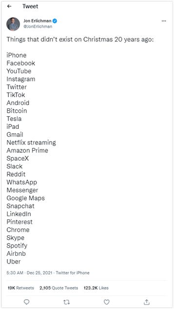
There is much else that doesn’t lend itself to easy visualization. Qualitative changes to the product infrastructure that mediates our connection to the world are just one example. Take, for instance, this list of things that didn’t exist 20 years ago:
Yet, the 50 “hockey stick” graphs above capture the essence of what many people intuit is true but lack the basic vocabulary to describe - that the country has dramatically, fundamentally and forever changed. In a few short decades, tens of millions of Americans have watched as the known, the familiar, and the ancestral have been swept away by a dizzying set of demographic, linguistic, social, cultural, political, religious, economic, and technological changes. These changes, which represent major adjustments to the constants undergirding our “fine-tuned liberal democracy,” foretell instability in the years ahead. As Lee Drutman puts it, “We as humans have a difficult time understanding exponential change. In calculus terms, we think in terms of the first derivative (steady rates of change), rather than in second derivatives (changing rates of changes). Thus, it is in periods where things seem all too quiet that we should expect trouble ahead. And it is in periods where it feels like we are rapidly careening towards trouble that we should expect even more fundamental change ahead.” The past, in other words, is a foreign country and things were much more stable there.